FlexGrid Academy Sdn Bhd: Building Responsive Designers for Modern Malaysia
We’re training the next generation of web professionals who understand mobile-first design, adaptive layouts, and responsive principles that actually work.
How We Started & What We’ve Learned
FlexGrid Academy Sdn Bhd began with a simple observation: Malaysia’s web industry needed better training on responsive design fundamentals.
The Problem We Saw
When we looked at web projects across Malaysia, we noticed a pattern. Designers were building for desktop first, then struggling to adapt layouts for mobile. Websites that looked great on laptops fell apart on phones. It wasn’t a skills problem — it was a methodology problem. Nobody was teaching responsive design as the primary approach, not an afterthought. We decided to change that.
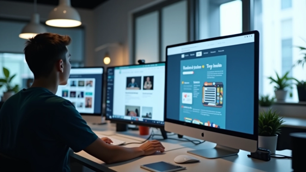
What We’ve Built
Since we started, we’ve trained over 450 designers and developers in responsive web design principles. Our students aren’t memorizing CSS tricks — they’re learning to think in breakpoints, flexible grids, and fluid typography. We’ve built a curriculum that works. It’s practical, it’s detailed, and it produces designers who can handle real-world projects. Most importantly, our graduates actually use what they learn.
Why We Do This
The web is mobile-first now. It’s not going back. Malaysian businesses deserve designers who understand this at a fundamental level. We’re committed to raising the standard of responsive design work across the country, one trained professional at a time.
Core Training Areas
Our curriculum covers everything you need to design truly responsive websites that work across all devices.
Mobile-First Strategy
Start with mobile design, then enhance for larger screens. This approach forces you to prioritize content and create efficient layouts.
Flexible Grids & Layouts
Master CSS Flexbox and modern layout techniques that adapt naturally to any viewport size without breaking your design.
Responsive Images
Learn how to serve the right image at the right size. We cover srcset, picture elements, and performance optimization.
Fluid Typography
Use modern CSS techniques like clamp() to create typography that scales smoothly across all screen sizes.
Modern CSS Techniques
We’re not teaching CSS from 2015. You’ll learn Grid, custom properties, container queries, and other tools professionals actually use.
Testing & Optimization
Real responsive design requires testing. We teach you how to test across devices, optimize performance, and debug layout issues.
How We Train Designers
We don’t just lecture. Our training combines hands-on projects, real client scenarios, and practical feedback.
Foundations First
We start with the fundamentals — viewport meta tags, media queries, responsive units, and how browsers interpret flexible layouts. You’ll understand the “why” behind responsive design, not just the “how.”
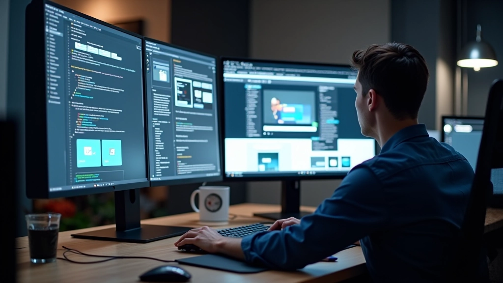
Hands-On Projects
Theory doesn’t stick without practice. You’ll build actual responsive websites from scratch — landing pages, portfolios, e-commerce layouts. Each project builds on the last one, getting progressively more complex.
Real Scenarios
We throw curveballs. What happens when your client wants a complex grid layout? How do you handle a carousel on mobile? You’ll encounter real challenges and learn practical solutions.
Portfolio Development
By the end of training, you’ll have a portfolio of responsive websites that showcase your skills to potential employers or clients. These aren’t practice exercises — they’re real work you’ll be proud to show.
Where We’re Headed
The web isn’t getting simpler. It’s getting more complex — more devices, new screen sizes, emerging technologies. But the core principle of responsive design stays the same: build for flexibility, not for fixed sizes.
We’re expanding FlexGrid Academy Sdn Bhd because we see the demand. Malaysian businesses are competing globally, and they need designers who understand adaptive layouts at the professional level. We’re training those designers right now.
In five years, we want responsive design thinking to be the default in Malaysia’s web industry. Not the exception. Not the nice-to-have. The default. We’re working toward that.
What Guides Our Work
These principles shape how we teach and what we believe about responsive design.
Practical Learning
We don’t teach theory in a vacuum. Every concept connects to real projects and actual client work. You’re learning what professionals actually do.
Community Focus
Responsive design improves when designers share knowledge. We’re building a community of Malaysian web professionals who support each other.
Current & Relevant
The web moves fast. We’re constantly updating our curriculum to reflect current best practices and emerging techniques in responsive design.
Quality Standards
We don’t just produce graduates. We produce designers who build websites that actually work, perform well, and delight users on every device.
“The training at FlexGrid Academy Sdn Bhd changed how I approach design. I stopped thinking about screen sizes and started thinking about flexible systems. My clients noticed the difference immediately.”
— Amir, Freelance Designer
Important Information
The educational content provided by FlexGrid Academy Sdn Bhd is designed to teach responsive web design principles and modern development practices. Individual learning outcomes depend on personal dedication, prior experience, and how thoroughly you apply these concepts to real projects. Success stories shared represent individual student experiences and may not reflect typical results for all participants. We recommend supplementing our training with hands-on practice and consulting with industry professionals for specific project requirements. Our materials are for educational purposes and should complement, not replace, professional guidance for specialized scenarios.