Master Responsive Design for Modern Websites
Learn fluid grids, mobile-first approaches, and adaptive layouts that work across every device. Build websites that users actually love.
Responsive Design Isn’t Optional Anymore
More than half of all web traffic comes from mobile devices. Your websites need to work everywhere — phones, tablets, desktops, and everything in between.
Mobile Traffic Dominates
More visitors arrive on phones than desktops. Ignoring mobile means losing potential clients, customers, and opportunities.
Search Engines Reward It
Google prioritizes responsive sites in rankings. Build for mobile first, and your SEO improves automatically.
Better User Experience
Users expect sites to work smoothly on their devices. When they do, people stay longer, engage more, and convert better.
Easier to Maintain
One responsive site beats managing separate mobile and desktop versions. Less code, fewer bugs, simpler updates.
Core Concepts You’ll Master
Fluid Grids & Flexible Layouts
Stop using fixed pixel widths. Learn how fluid grids scale naturally, adapting to any screen size without breaking your design.
Mobile-First Methodology
Design for the smallest screens first, then enhance for larger devices. This approach is cleaner, faster, and actually easier to implement.
Media Queries & Breakpoints
Master CSS media queries to target specific devices and screen sizes. We’ll show you the breakpoints that actually matter in real projects.
Flexible Typography & Images
Make text readable on any device using responsive sizing. Learn how to scale images without losing quality or breaking layouts.
Featured Learning Resources
Dive deep into the topics that matter most for building responsive websites that work.

Understanding Fluid Grids and Flexible Layouts
Learn how fluid grids work and why they’re essential for responsive design. We break down the math and show you practical examples.
Read Guide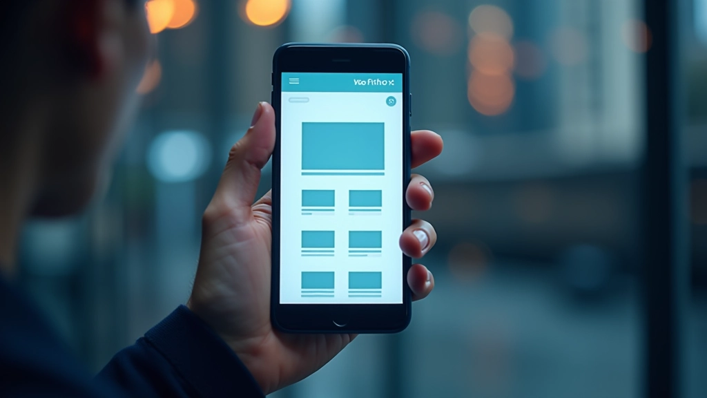
Mobile-First Design: Where to Start
Mobile-first isn’t just a buzzword. Here’s how to actually implement it in your projects and why it makes design decisions easier.
Read Guide
Media Queries: The Foundation of Responsive CSS
Media queries aren’t complicated once you understand how they work. We’ll walk through common breakpoints and practical patterns you’ll use daily.
Read GuideWhat Designers & Developers Say
“Wasn’t sure I understood media queries until I went through the modules. They break it down step-by-step and suddenly it all clicked. Now I’m actually confident building responsive sites.”
“The mobile-first approach changed how I design. I used to build desktop-first and try to shrink it down, which was painful. This way makes so much more sense and saves me hours on every project.”
“I’d been doing responsive design wrong for years without realizing it. The fluid grids section alone was worth it — my layouts don’t break anymore and they actually scale properly.”
Learning That Actually Sticks
We don’t just explain concepts — we show you how they work with real, practical examples you can use immediately.
Hands-On Examples
Every concept includes working code examples you can inspect, modify, and learn from. See it in action, then build it yourself.
Progressive Learning
Start with basics, progress to advanced techniques. Each module builds on what you’ve already learned, so nothing feels overwhelming.
Real-World Scenarios
We use actual design challenges you’ll face in projects — not made-up problems. Learn solutions you’ll actually use.
Ready to Build Better Responsive Websites?
Get started with our comprehensive training. Learn at your own pace and apply what you learn immediately to your projects.