
Understanding Fluid Grids and Flexible Layouts
Learn how fluid grids work and why they’re essential for responsive design. We break down the math and show you practical examples.
Read MoreMaster modern techniques for building websites that work beautifully on every device. Learn adaptive layouts, mobile-first design, and practical implementation strategies.
We’re here to help you understand the fundamentals of responsive design. From fluid grids to flexible images, we’ve broken down everything into clear, actionable lessons. Whether you’re starting from scratch or refining your skills, you’ll find practical guidance that actually works in real projects.

Explore practical guides and techniques for building responsive websites
Learn how fluid grids work and why they’re essential for responsive design. We break down the math and show you practical examples.
Read More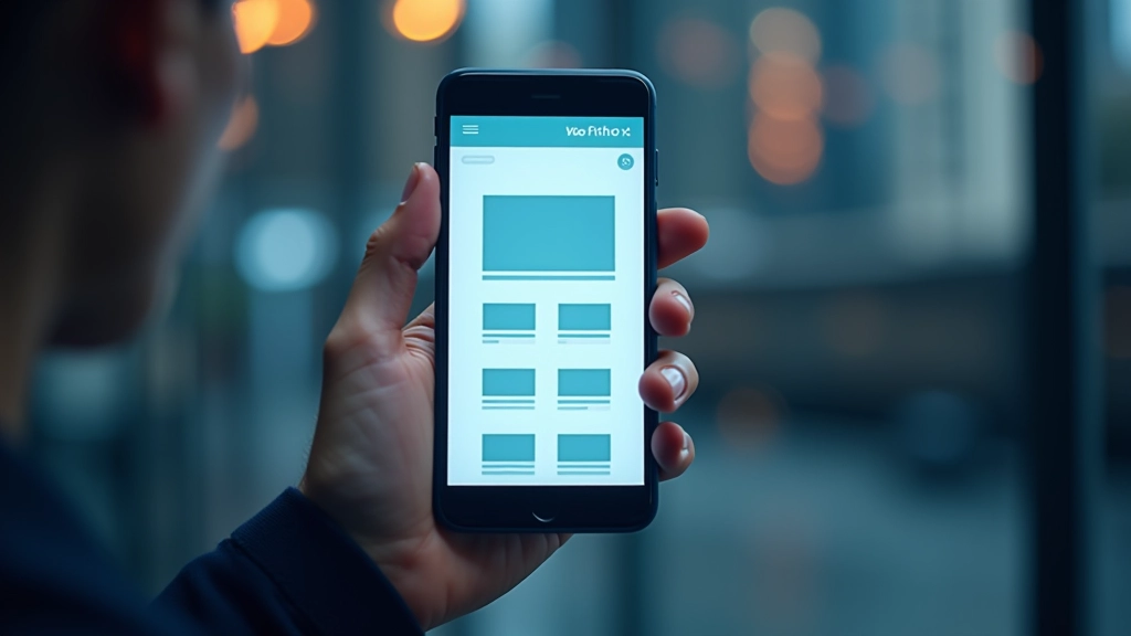
Mobile-first isn’t just a buzzword. Here’s how to actually implement it in your projects and why it makes design decisions easier.
Read More
Media queries aren’t complicated once you understand how they work. We’ll walk through common breakpoints and practical patterns you’ll use daily.
Read More
Images can break responsive designs if you’re not careful. Learn srcset, picture elements, and techniques to keep images looking sharp on all screens.
Read MoreThese foundational ideas show up in every responsive design project. Understanding them deeply makes everything else click into place.
The viewport meta tag tells browsers how to handle device width and scaling. It’s a small line that makes a huge difference. Without it, your responsive design won’t work properly on mobile devices.
You don’t need dozens of breakpoints. Most projects work fine with three or four key breakpoints. The trick is choosing breakpoints based on your content, not just device sizes.
Pixels are fixed. That’s why responsive design relies on percentages, ems, and rems. Learning when to use each unit is crucial for layouts that actually adapt smoothly.
Mobile devices use touch, not mouse cursors. That means buttons need to be bigger, spacing needs adjustment, and hover states don’t work the same way. Plan for touch from the start.
You don’t need expensive software. These practical tools make responsive design work easier and faster. Most are free or have solid free versions.
Built right into Chrome, Firefox, and Safari. Use the device toolbar to test different screen sizes instantly. This is your main testing environment.
Quick online tools let you see your site on multiple devices at once. Great for spotting issues before you spend time debugging.
Figma and Adobe XD have built-in responsive design features. Design your layouts on artboards that represent actual device sizes.
Bootstrap and Tailwind give you responsive grid systems. They’re helpful for learning how responsive layouts work and for faster prototyping.