Our Work
Real projects from real students who’ve mastered responsive design
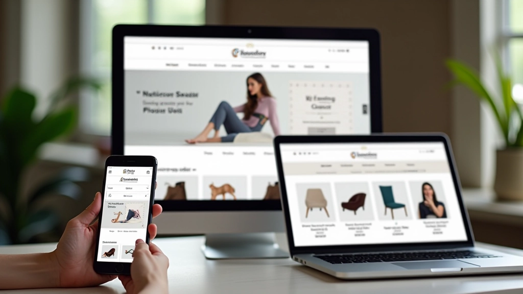
Local Fashion Brand Redesign
A Kuala Lumpur fashion retailer needed their site to work smoothly on mobile. We rebuilt their product pages using CSS Grid and Flexbox. Mobile traffic jumped 45% in the first month.
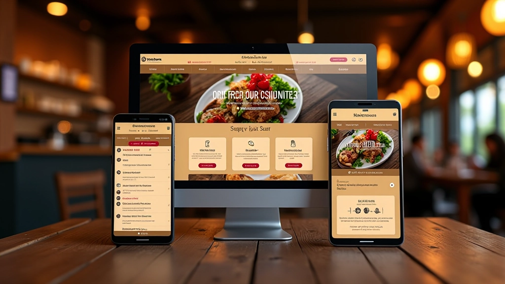
Penang Restaurant Multi-Device Site
Built a mobile-first site for a heritage restaurant chain with 8 locations. Implemented fluid typography and adaptive menus. Reduced bounce rate by 32% and increased online reservations.

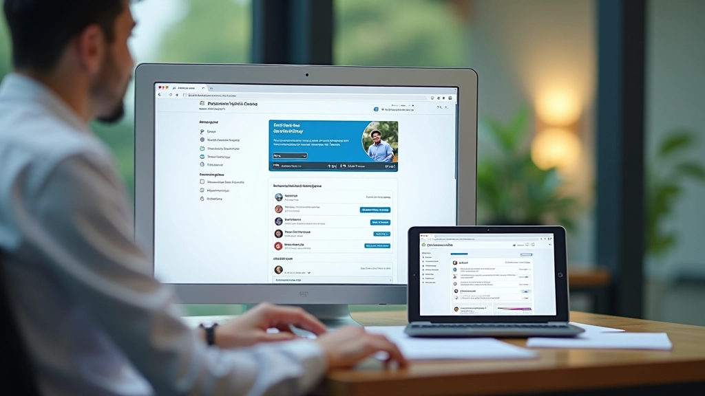
Johor Manufacturing Services Portal
Redesigned a B2B services site using modern breakpoints and flexible components. Site now serves 70% of traffic from mobile devices without any layout issues.
Selangor Online Learning Platform
Created a responsive learning management system for a local training provider. 450+ students across Malaysia access courses daily. Used CSS Grid for the course dashboard and Flexbox for component layouts.
Ready to build responsive sites?
Join our training programs and create websites that work beautifully on every device.
Get Started Today