Media Queries: The Foundation of Responsive CSS
Media queries aren’t complicated once you understand how they work. We’ll walk through common breakpoints and practical patterns you’ll use daily.

What Are Media Queries?
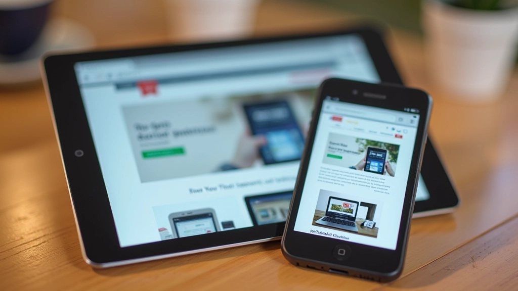
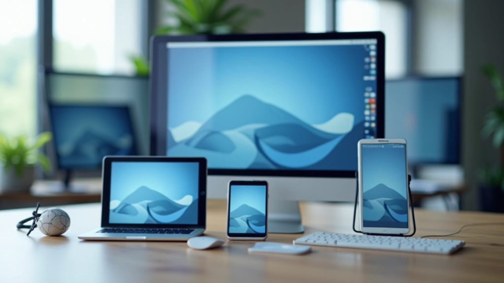
Think of media queries as conditional statements for CSS. They’re the mechanism that lets your website adapt to different screen sizes, orientations, and device capabilities. Without them, you’d be stuck with a one-size-fits-all design—which doesn’t work anymore. Most users browse on phones now, so you’ve got to meet them where they are.
The basic syntax is straightforward. You’re telling the browser: “Hey, if this condition is true, apply these styles.” It’s that simple. The condition is usually about viewport width—like “if the screen is wider than 768 pixels, do this.” Once you grasp that concept, everything else builds from there.


The Basic Syntax
Here’s the foundation you need to remember. A media query starts with @media, followed by the condition you’re checking. The most common one is (max-width: 768px) or (min-width: 768px). That number—768px—is your breakpoint. It’s the threshold where styles switch.
You’ll see patterns like this everywhere. Mobile first means you write styles for phones first, then add media queries for larger screens. Desktop first is the opposite—start with desktop styles, then adjust down. Most developers today prefer mobile first because it forces you to prioritize what actually matters on small screens.
Pro tip: Use rem units instead of pixels when possible. It respects user preferences and scales better. A breakpoint at 48rem (768px) is more flexible than hardcoding 768px everywhere.
Common Breakpoints You’ll Actually Use
Let’s be honest—you don’t need to support every possible screen size. You need breakpoints that cover the devices your users actually visit on. Mobile phones, tablets, laptops. That’s three breakpoints. Most projects work fine with exactly that.
The industry standard breakpoints have settled around specific widths. Mobile phones max out around 480px. Tablets sit around 768px. Desktops start at 1024px, and large monitors at 1440px. You won’t always use all of these. Pick the ones that make sense for your design.
Practical Patterns That Work
You’ll run into the same layout problems repeatedly. Navigation menus that need to collapse on mobile. Grid layouts that go from 3 columns to 1. Font sizes that should be bigger on desktop. Media queries solve all of these. The patterns you develop early on become your toolkit for everything that comes next.
Start simple. Hide elements with display: none on mobile, show them on desktop. Change grid-template-columns from 3fr 1fr to a single column. Bump up font sizes at bigger breakpoints. Don’t overthink it. You’re not trying to be clever—you’re trying to make the design work at every size.
One thing that’ll save you hours: test your breakpoints with real devices or browser dev tools. Not every 768px device is a tablet. Some phones are wider than tablets. Your design should feel right at the actual sizes people use, not just at arbitrary numbers.
Beyond Just Screen Width
Media queries aren’t limited to viewport width. You can check for orientation (portrait or landscape), device pixel ratio (for retina screens), color scheme preferences, and more. Most of the time you’ll stick with width, but knowing what’s possible helps you solve edge cases.
The prefers-color-scheme query is useful now. It respects whether someone has dark mode enabled on their device. You can write media queries that adapt your design to their system preference. That’s the kind of detail that makes a site feel polished.
Common media query features:
- (max-width: 768px) — screens 768px or narrower
- (min-width: 1024px) — screens 1024px or wider
- (orientation: landscape) — landscape orientation
- (prefers-color-scheme: dark) — user prefers dark mode

Getting Started
You don’t need to master every advanced feature right now. Start with mobile-first CSS and add breakpoints at 768px and 1024px. That’ll cover 95% of what you’ll actually build. Test on real devices. Adjust the breakpoints if they don’t feel right for your design.
Media queries are the foundation of modern web design. They’re not going anywhere, and they’re not complicated. You’re just telling the browser how to adjust your styles based on what device someone’s using. That’s it. Master that concept, and you’ve got the core skill responsive design needs.
Ready to Build Responsive Designs?
Understanding media queries is the first step. Combine them with fluid grids and flexible images, and you’ve got the complete responsive design toolkit.
Explore More ArticlesDisclaimer
This article provides educational information about CSS media queries and responsive design principles. Web technologies evolve continuously, and browser support for specific features may vary. Always test your code across multiple browsers and devices. For the most current CSS specifications and browser compatibility information, refer to official resources like MDN Web Docs or the W3C CSS specification.