
Understanding Fluid Grids and Flexible Layouts
Learn how fluid grids work and why they’re essential for responsive design. We break down the math and show you practical examples.
Read ArticleMobile-first isn’t just a buzzword. Here’s how to actually implement it in your projects and why it makes design decisions easier.
Here’s the reality: over 60% of web traffic comes from mobile devices. If you’re still designing desktop-first and then squeezing things down for phones, you’re doing it backwards. Mobile-first design forces you to make better decisions because you start with constraints.
Think about it differently. When you start small, you’re forced to ask what’s actually essential. What can stay? What’s just visual decoration? This thinking flows into better desktop experiences too. You’re not adding features — you’re building a solid foundation and enhancing it.

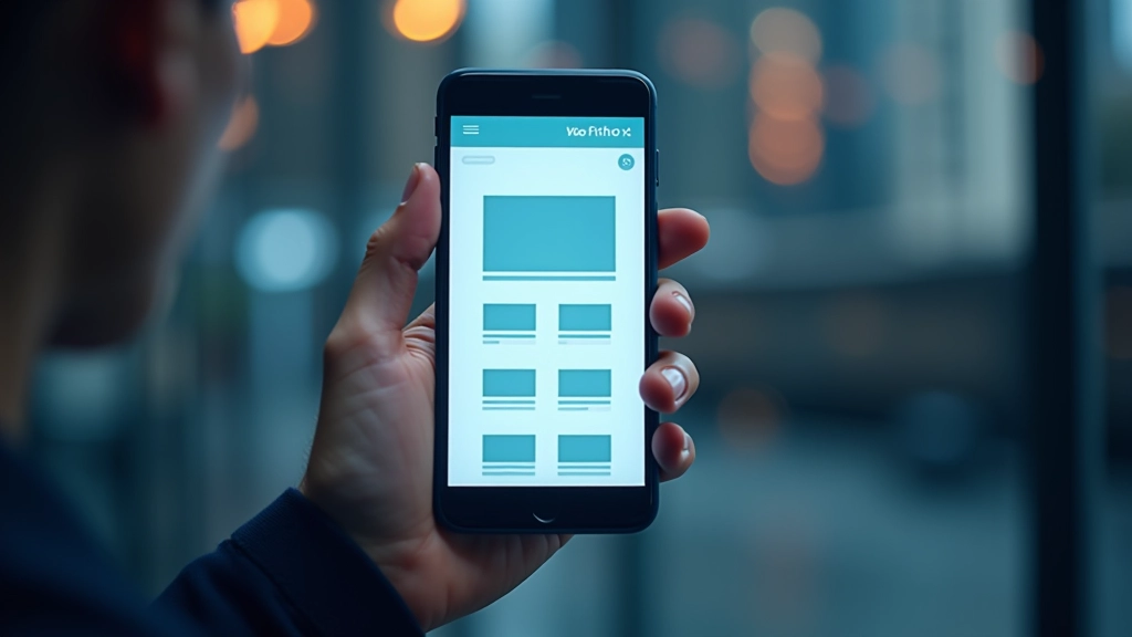
Mobile-first design starts with three straightforward principles. First, you’re designing for the smallest screen first. That means 320 pixels wide on an older phone — not 1440 pixels on a desktop. Second, you’re using CSS media queries to add complexity as screens get bigger. Third, you’re thinking about touch interactions, not mouse hovering.
The practical impact? Your CSS becomes cleaner. You’re not overriding styles with min-width queries. Instead, you’re building up. Mobile styles are your baseline. Tablet gets `@media (min-width: 768px)` to adjust things. Desktop gets `@media (min-width: 1024px)`. This progression is natural and maintainable.
Most teams find that mobile-first actually speeds up development once you commit to it. You’re not juggling conflicting breakpoints or trying to remember why something’s hidden on desktop but visible on tablet.

Start with the viewport meta tag in your HTML head. This tells browsers how to scale content. It’s not optional — it’s essential. Add ` ` and you’re already ahead of most sites.
Your base CSS applies to 320px screens. Single column layout, touch-friendly buttons (minimum 44px height), readable text sizes. Don’t use media queries yet. Just make it work on the smallest device you’re targeting. This becomes your foundation.
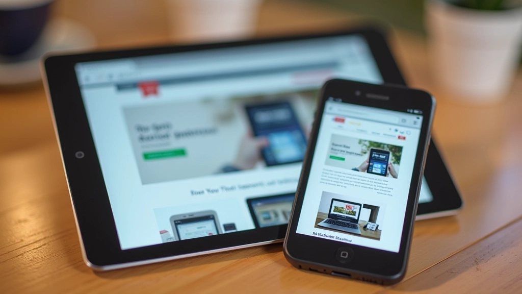
Now add your first breakpoint at 768px (tablets). Maybe you’re going two-column here. Then 1024px for larger tablets. Then 1440px for desktops. Each breakpoint only handles what’s different — you’re not resetting everything.

Working mobile-first changes how you think about every element on your page.
You’ll start with a hamburger menu or vertical stack. This forces clarity — only the essential navigation items stay visible. When you enhance for desktop, you’re adding a horizontal menu from a place of intention, not default complexity.
Mobile-first means you’re thinking about image sizes from the start. You’re using srcset and picture elements to serve appropriate resolutions. On desktop, you’re not just scaling up the mobile image — you’re optimizing for larger screens with better quality.
Small screens force you to rank what matters. Headlines, primary CTA, essential content come first. Sidebar widgets? Secondary features? They appear as you add breakpoints. You’re being intentional instead of squeezing everything in.
Mobile users often have slower connections. Starting mobile-first keeps you aware of performance. You’re not lazy-loading desktop images on mobile. You’re serving the right assets to the right devices. It’s built into your approach.
“Mobile-first design isn’t about phones. It’s about prioritizing clarity and purpose. When you design for constraint, everything gets better — including your desktop experience.”
— Design principle in modern web development
You don’t need fancy software to do mobile-first design. The fundamentals work with whatever tools you’re already using.

Most designers mess up mobile-first in the same ways. Here’s what to watch for.
Don’t write `@media (max-width: 768px)`. You’re working mobile-first, so use `@media (min-width: 768px)` to add complexity as screens grow. It’s cleaner and more maintainable.
Without it, browsers zoom out to fit desktop content on mobile. Your design breaks immediately. It’s one line — don’t skip it.
Your phone isn’t representative. Test on actual devices if possible, or at minimum use DevTools responsive mode at actual breakpoints. Don’t assume.
Hover effects don’t exist on touch devices. If your entire interaction design relies on hover, you’ve designed for desktop first. Mobile-first means touch-first interaction patterns.
Mobile-first design isn’t a trend that’ll fade. It’s become essential because most people browse on phones. But the real benefit? It makes you a better designer. You think clearer, you prioritize better, and your code becomes more maintainable.
You don’t need permission to start. Your next project can be mobile-first. Open DevTools, test at 320px, and build from there. After a few projects, it’ll feel natural. You’ll wonder why you ever designed desktop-first.
The best time to have started was five years ago. The second best time is right now.
Check out the related articles below to master media queries, fluid grids, and responsive images.

This article provides educational information about mobile-first design principles and responsive web design techniques. While these practices are widely adopted and considered industry standards, the specific implementation details, tool recommendations, and techniques mentioned here may vary depending on your project requirements, existing tech stack, and team expertise.
Every website has unique constraints. Browser support, legacy system requirements, and specific user demographics may affect how you apply mobile-first principles. We recommend testing thoroughly on your actual target devices and consulting with your development team before implementing significant changes to your design workflow.
The web development landscape evolves continuously. Best practices mentioned here reflect current standards as of February 2026, but may change as new technologies and approaches emerge.