Understanding Fluid Grids and Flexible Layouts
Learn how fluid grids work and why they’re essential for responsive design. We break down the math and show you practical examples.

What Are Fluid Grids?
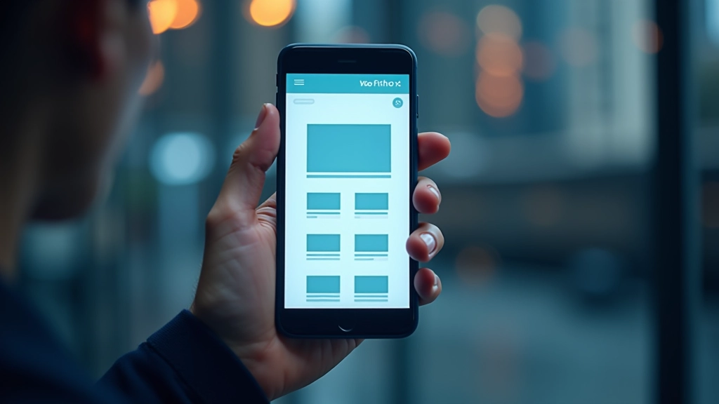
Fluid grids aren’t complicated once you understand the core concept. Instead of fixed pixel widths, they’re built on percentages and proportions that scale with the viewport. That’s it. A column that’s 50% wide will always take up half the screen — whether that screen is 320 pixels or 1920 pixels.
The real power comes from combining fluid grids with flexible images and media queries. Together, they’re the foundation of responsive design. You’ll see how websites like Medium and The New York Times handle this — their layouts feel natural on phones, tablets, and desktops because they’re built on fluid principles.
The Math Behind Fluid Grids
Here’s the formula you’ll see everywhere: target / context = result. Let’s say you want a sidebar that’s 250 pixels wide inside a 1000-pixel container. That’s 250 1000 = 0.25, or 25%. Simple. The beauty is that 25% stays 25% no matter what size the container becomes.
Most designers use a 12-column grid as their foundation. It divides nicely — one column is about 8.33% of the width. Two columns? 16.66%. Three? 25%. You’re not locked into these numbers, though. Some projects use 16 columns, others use 8. The important thing is picking a system and staying consistent.
Don’t get hung up on the math. Modern CSS frameworks like Bootstrap handle the calculations for you. But understanding the principle matters. It’s what lets you adapt designs quickly when a client suddenly needs a different layout on tablets.


Building Your First Fluid Grid
You’re probably using flexbox or CSS Grid today, which is great. They handle fluid layouts beautifully. But understanding the underlying percentages helps you make better decisions about spacing and proportions.
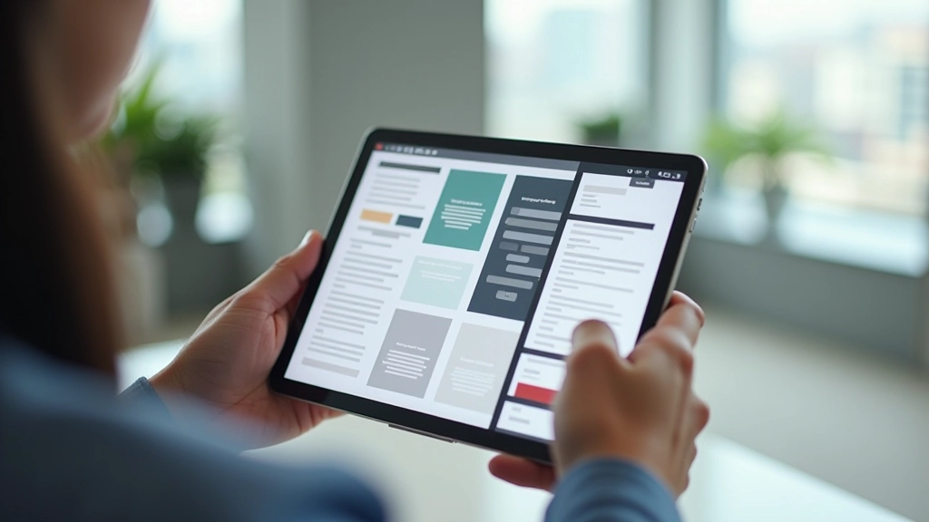
Start with a container — let’s say 1200 pixels max width. Inside that, you’ll define your columns. If you want three equal columns, each gets about 31% width (leaving room for gaps). Add a 2% gap between columns, and you’re at 33% each. That’s the whole concept. Everything flows from that basic principle.
The tricky part? Making sure everything still looks good when the viewport shrinks. That’s where media queries come in. You’re not changing the grid itself — you’re changing how many columns stack at different breakpoints. On mobile, those three columns stack into one. On tablet, maybe two. On desktop, three again.
Beyond Fixed Widths: True Flexibility
The real magic happens when you stop thinking in pixels. Most designers start with a fixed layout — say, 960 pixels wide. Everything’s constrained to that box. Fluid grids flip that thinking. Your content expands and contracts based on available space.
This doesn’t mean abandoning structure. You still have a grid. You’re just defining it in percentages and proportions instead of fixed pixels. A header that’s 100% wide on mobile becomes 80% on desktop with centered margins. Navigation that stacks vertically on phones sits in a sidebar on tablets.
The flexibility also means less redesign work. Want to accommodate a new device size? Often, your existing fluid layout already handles it gracefully. You might tweak spacing or hide some elements, but the core structure adapts automatically.

Practical Tips for Fluid Layouts
Use max-width, not width
Set max-width: 100% on images and containers. This prevents them from breaking the layout on smaller screens while letting them scale up naturally.
Think in ratios, not pixels
When designing, ask yourself: “What percentage of the screen should this element take?” Not “What’s the pixel width?” This mindset makes responsive design intuitive.
Test at real breakpoints
Common breakpoints are 320px (mobile), 768px (tablet), and 1024px (desktop). But test your actual content. Sometimes a specific width breaks your layout. That’s where you add a media query.
Use relative units for spacing
Em, rem, and percentages scale with your base font size. This keeps proportions consistent across different device sizes and helps maintain readability.
Combine with flexible images
Fluid grids are only half the story. Your images need to be flexible too. Use srcset and picture elements to serve appropriate image sizes at different breakpoints.
Plan your breakpoints early
Before you start coding, decide where your layout changes. Will you go from 1 column to 2 at 600px? 2 to 3 at 1200px? Document this. It saves time later.
“A fluid grid isn’t about making one design that looks okay everywhere. It’s about making a design that feels natural at every size. That’s the whole point.”
— Ethan Marcotte, Responsive Web Design pioneer
Tools and Frameworks That Use Fluid Grids
You don’t need to build everything from scratch. These frameworks handle fluid grids automatically, so you can focus on design and content.
Bootstrap
Industry standard with a 12-column responsive grid system. Hundreds of components built on top. Great for rapid development, especially if you need consistent UI.
Tailwind CSS
Utility-first approach gives you fine-grained control over layouts. Build custom grids exactly how you want them. Slightly steeper learning curve but incredibly flexible.
Foundation
Professional-grade framework with mobile-first approach built in. Popular in enterprise projects where accessibility and browser support matter most.
CSS Grid (Native)
Modern browsers support CSS Grid natively now. You can build sophisticated fluid layouts with just CSS, no framework needed. Powerful but requires understanding grid concepts.
Start Simple, Build Confidence
Fluid grids aren’t some advanced technique reserved for experienced designers. They’re actually simpler than fixed-width layouts once you get the percentage concept. Start with a basic 12-column grid. Make everything percentage-based. Add media queries to adjust at key breakpoints. That’s a responsive layout.
The math seems intimidating at first, but you’ll develop intuition quickly. After a few projects, you’ll naturally think in proportions instead of pixels. You’ll anticipate how layouts will scale. You’ll make smarter decisions about spacing and sizing.
And honestly? Your designs will be better. Users on any device — from old Android phones to massive 4K displays — will have a good experience. That’s what responsive design is really about. Not checking boxes. Building experiences that work everywhere.
Ready to dive deeper?
Now that you understand fluid grids, explore how media queries and flexible images complete the responsive design picture.
Continue LearningDisclaimer
This article provides educational information about fluid grids and responsive design principles. While these techniques are industry-standard and widely used, implementation may vary depending on your specific project requirements, browser support needs, and accessibility considerations. Always test your designs across multiple devices and browsers. Consult current web standards and accessibility guidelines (WCAG) when building production websites.